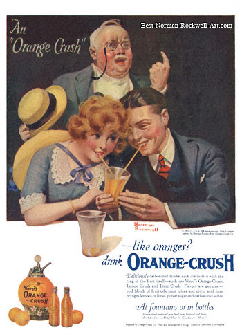
I grew up drinking milkshakes, but I didn't know that sharing one is a thing in America! So, add another two billion people to that number (highly scientific estimate).
The whole soda fountain phenomenon was before our time, so I'm not sure that milkshakes were available at most soda fountains, but it's easy to imagine the tableau relocated to the ice cream shop. The "milkshake icon" seems more evocative than the "soda icon".
I think something gets lost when we call this kind of shortcoming a missing feature... A missing feature is too easy to dismiss since we can mention all these scary words like "paralytic featur-itis." The fix here involves no new dialogs, no additional learning curve, nothing fancy whatsoever. It's just a case of absent-minded application design, and the point stands that it makes a tremendous difference in the end product.
Another possibility is that the developers implemented it and the UI designers/tech writers insisted that it be eliminated because it would "confuse the users".


https://en.m.wikipedia.org/wiki/Jevons_paradox